By Dr. Ken Broda Bahm –

When we think of great attorneys, the skills that we most often cherish are persuasion and logic — the power to get a judge or jury to think and to do what you want. But what about the ability to inform, to explain, to simply make something clear? An effective teacher can be more trusted, and ultimately more effective, than even an attorney with a full briefcase of rhetorical technique. After all, if you can get your fact-finders to understand the critical point from your perspective, then you are more than half-way to persuading them.
It is in that context that we focus on the second part of our series on visual persuasion, reporting the results of a large scale (1,375 mock jurors) study of the effectiveness of different forms of demonstrative exhibit use in litigation. In this post, we focus specifically on the role of visuals in building comprehension. The finding? Good visuals help teach the case, but the best visual teacher lies not in the occasional use of graphics, but in an immersion approach, with an attorney or witness using a continuous graphic presentation (like a well-designed PowerPoint deck) to accompany their verbal explanations.
The PS Visual Persuasion Study.
To look at how attorneys can use graphics most effectively, we took an experimental approach and developed five separate versions of the same defense presentation, differing only in the style of visuals used, and tested it out against a plaintiff using 1,375 mock jurors. We compared five different approaches to visual persuasion:
1. No graphics
2. Flip-chart graphics, created live
3. Static graphics, designed, but not animated
4. Animated graphics
5. Immersion: a mix of static and animated graphic used continuously, so that imagery was shown throughout the presentation
We tested juror perception immediately following the presentations, as well as three to five days later. What we found, we’re reporting for the first time in these blog entries (See part one for a more complete description of the study).
Difficult Causation Arguments
The fact pattern that we developed saddled the defense, realistically, with some difficult causation arguments. The case involved a 16-year-old boy who was brain injured after a baseball that he pitched was hit back toward him by an aluminum alloy bat at an unexpectedly high rate of speed. The defense to this defective products claim against the bat-maker focused on the argument that the same injury could have been produced by a ball coming off any bat. The company also claimed that there were other causal factors (including a vulnerable pitching position, and a banner behind home plate that reduced the pitcher’s ability to see the ball).
Thus, one thing that we wanted to look at is whether jurors could get past the simple “first A then B” thinking (Bat hits ball, ball hits boy) in order to consider more specific causation questions. Part of our approach was to test jurors on their comprehension. We found that those jurors who saw the continuous visual approach were able to correctly identify the defense causation arguments (better recall) than jurors who saw either no graphics, or a different graphics approach: an average of seven correct answers out of eight possible, compared to around six and a half in the other conditions (p<.05). It isn’t a large or dramatic advantage, but it is a statistically significant one: a small but reliable edge for attorneys who want to make sure that jurors have the most accurate understanding possible.
Memorable Damages Numbers
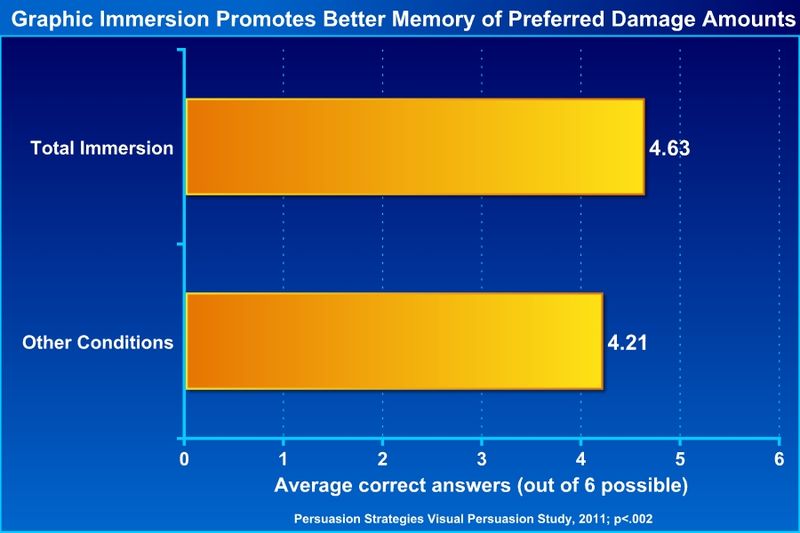
In this case, the defense wanted to hedge its bets against a liability finding by providing an alternate number for damages. Because the plaintiffs in this case were arguing for substantial lost earnings, and a fairly elaborate life-care plan for the injured boy, the defense needed something other than an open wallet in case the jury got to that point. But in order for jurors to anchor on an alternate number, they first need to remember it. In our study, we tested our mock jurors’ ability to remember alternate damage numbers in the same way that we did for causation: by checking the accuracy of their recall. Again, jurors in the immersion condition had better recall of the correct numbers by a statistically significant margin – a small but dependable advantage:

(Please click to see full-sized image)
Interestingly, those in the visual Immersion condition also had significantly smaller decrease in their recall of the defense damages numbers, when measured three to five days later, than those in the other conditions (p < .0001).
Recommendation:
One clear recommendation is that, while you shouldn’t expect graphics to make your case by themselves, you can rely on a small advantage if you use graphics to teach, especially when you use them continuously to accompany an opening or a closing argument. But one thing that attorneys don’t always consider is the fact that you can also incorporate continuous graphics in expert witness examination.
That is right, you can help turn your expert into a teacher with the magic of PowerPoint.
Of course, testimony is presented as Q and A, not as a direct speech to the jury. But it is possible to subtly shift to a more presentational mode without drawing an objection:
Attorney: Doctor Green, when you say “overlapping belt construction,” what does that mean? Can you explain that to me and to the jury?
Expert: Well, yes, I’ve prepared a slide show which I think demonstrates this.
Attorney: Your honor, if I may, I have those slides and they’ve been provided to plaintiffs’ counsel…
Court: Go ahead, for demonstrative purposes.
Attorney: Okay, Doctor Green, I’ll just hand you the ‘clicker’ so you can advance the slides when you need to…
And suddenly, what was dry legal questionning becomes an engaging college class. But there are three rules to this approach:
1. The slides are prepared by the expert. They can get whatever help they want from attorneys, consultants, or graphic experts, but for the testimony to be natural and believable, the slides should be the expert’s product.
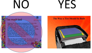
2. The slides should practice good visual hygiene. That is, don’t just put speaking notes on a slide. That isn’t effective because it requires jurors to read and listen at the same time, and pulls attention away from the expert and toward the screen alone. Instead, the slides should consist of clear and simple visual reinforcements to accompany the expert’s testimony.
3. The attorney recedes, but does not disappear. If your adversary is awake during this teaching moment from the expert, then you’re likely to draw an objective for “narrative.” But this can be avoided as long as you keep the lawyer in the process, asking helpful, transitional questions as the presentation goes along. If it sounds scripted, it will ring false. But if it sounds like the lawyer is just trying to get clarification — to be “the voice of the jury” — then it will seem natural and educational.
Ultimately, the goal is to give the expert that power to be the teacher, and to hold the jury’s interest by immersing them in well-prepared and simple visuals.
______
Other Posts in This Series:
______
Image Credit: Eyechartmaker.com
