By Dr. Ken Broda Bahm –
We all remember “show and tell,” and at least back then we understood intuitively that if we tried to just tell, without showing, we couldn’t expect much attention from the class. The same applies in litigation, and in a way you might not expect. This post is the first in a five-part series, reporting for the first time on the results of our own large scale (1,375 mock jurors) original research study focusing on the effectiveness of visual persuasion in a litigation context. These results have not been published anywhere, until now. The conclusions I’ll be sharing in the next five posts do not focus on the obvious point that it is helpful to use graphics when talking to juries (we all pretty much knew that already). Instead, my focus is on the best ways to use graphics, contrasting five different approaches, as well as on the specific effects that these approaches have on comprehension and the credibility assigned to different arguments.
An important part of the story is the path that we took in the research. Midway through the project, we learned something very important: the occasional use of graphics is not enough. We added a fifth condition to the study and found that to get the full benefits of visual persuasion, attorneys should be using a continuous approach, giving the jury something to look at (other than you) at all times. Instead of following the practice of most attorneys in only using the screen periodically to show a document or image when a particular need presents itself, effective attorneys use graphic immersion: an approach relying on continuous imagery to reinforce all parts of your message. This approach, reflected in the best uses of PowerPoint, turns out to be most effective of all the graphic modes we tested.
While upcoming posts in this series will go into greater detail on the advantages we found, this first post will describe the research, discuss why a continuous visual approach has advantages, and share several recommendations for incorporating continuous graphics in opening statement.
What Was The Study?
Participants: We randomly recruited 1,375 jury-qualified and demographically diverse participants to serve as mock jurors in an on line experiment in late 2010 and early 2011. Screened participants completed the study at a secure website.
Stimulus: Working with two Holland & Hart attorneys, we created and video-recorded forty minutes of summary arguments from the plaintiff and defense sides of a products liability suit. The case involved a 16-year-old boy who was brain injured after a baseball he pitched was hit back toward him by an aluminum alloy bat at an unexpectedly high rate of speed. The plaintiffs’ claim that the bat was unreasonably dangerous because its design and manufacture made it possible to hit the ball at greater speeds than those associated with wood bats or other aluminum bats. The defense claimed that the same injury could have been produced by a ball coming off any bat. The company also claimed that there were other causal factors (including a vulnerable pitching position, and a banner behind home plate that reduced the visibility of the ball).
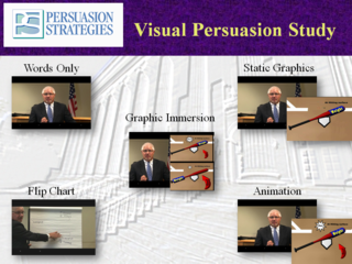
Conditions: Participants all saw the same version of the plaintiffs’ presentation, but were randomly assigned to one of five versions of the defense presentation. Versions were created using the same source video (to keep delivery constant) while adding the different styles of visual persuasion via editing. The script only differed in short phrases (e.g., “as this chart shows…”), made necessary by the different visual approaches. The five versions were:
1. No graphics
2. Flip chart graphics, created live
3. Static graphics, designed, but not animated
4. Animated graphics
5. Immersion: a mix of static and animated graphics used continuously so that imagery was shown throughout the presentation
 (Please click on image to see full sized version)
In conditions 2, 3, and 4, the same concept was represented using the different visual modes. We chose one contested issue for liability, one for causation, and one for damages.
Process: Our mock jurors completed an initial survey, then viewed the plaintiff’s summary argument and one of the five defense versions of the summary arguments, then completed a final survey including a verdict form. We analyzed the data to look for significant and meaningful differences between the conditions using analysis of variance (ANOVA) and multiple analysis of variance (MANOVA) techniques.
So How Did the Different Versions Perform?
This is the part that we learned on the job. Initially, it didn’t occur to us to include an immersion version. We tested no graphics versus flip chart versus static graphics versus animation. When the results for those four conditions came in, we were surprised at how little difference it made. In each of the four conditions, we saw close to 55 percent favoring the plaintiff and 45 percent favoring the defense. While there were small differences in credibility or comprehension of specific points, there was unexpectedly no consistent pattern favoring one graphic approach over the others.
That told us two things. One, our mock jurors seemed to be stubbornly responding to the facts of the case more than just the mode of presentation — rather like real jurors. And two, the occasional use of graphics did not seem salient enough to make a significant difference. In the context of an 18-minute summary, the defense attorney’s use of three key visual aids only took up approximately three and a half to four minutes. So the dominant experience for the mock jurors, realistically enough, was listening to an attorney speak, and the periodic breaks to include graphics weren’t enough to engage the jurors in any different way.
So, to test the theory that a more continuous engagement with graphics would be more effective, we created the fifth version, focusing on immersion. Using the same videorecording of the attorney, we layered on a visual component that continuously but simply underscored what the attorney was saying. We continued the use of the static and animated graphics used in the other version, but also added simple text, imagery, and charts to provide a continuous visual flow that would reinforce, and not compete with, our defense attorney’s arguments.
The Advantages of Visual Immersion
Comparing the results of this visual immersion to the other versions, we noticed a number of important advantages that will be covered more specifically in the upcoming posts in this series. But overall, we found a far greater number of statistically significant conclusions as well as a consistent pattern in those conclusions: in nearly all cases, the version based on the continuous use of graphics performed better than versions including no graphics or occasional graphics.
Why would it be better to provide your audience with a continuous visual track to the presentation? We would love to wire jurors up to neuroimaging technology to find out exactly why, but for now, there are two good theories.
One, because it is cognitively more complete. By showing as well as telling throughout the presentation, you are engaging and using more of the jurors’ working attention, causing them to pay more attention, and to notice and see more of your argument. This is often referred to as “the cognitive theory of multimedia learning:”
“People have two separate information-processing channels – one for visual/pictorial processing and one for auditory/verbal processing. When words are presented as narration, the auditory/verbal channel can be used for processing words (i.e., the narration) and the visual/pictorial channel can be used for processing pictures (i.e., the animation, so neither one is excessively overloaded” (Mayer, 2001, p. 139).
Two, because it requires less mode-shifting. When you interrupt a verbal explanation with a sudden request to, “hey, look at this…” you are asking your listener to change the way that they’ve been paying attention. Instead of listening, they are now looking. When you are done with the visual part, they’ll go back to just listening. Of course, we have sophisticated brains, so we can accomplish those switches with ease, but it is reasonable to still expect a little bit of information loss as we jump from one style to another. Better, the theory goes, to keep a listener engaged using one combined and mutually reinforcing visual and verbal approach.
More superficially, an audience could also simply see greater visual use as a sign of greater preparation, which by itself can make a source more credible.
Taking Legal Persuasion ‘Beyond Bullet Points’
Of course, the idea of using comprehensive visuals (PowerPoint or Trial Director, for example) is not new to lawyers. Still, for every lawyer who makes complete use of graphics throughout an opening statement, there are dozens who either present using no graphics, or using only the occasional graphic. Even for those who have discovered PowerPoint, the resulting presentations will often bear a suspicious resemblance to their speaking notes, blown up on the screen. That, decidly, was not our approach. Instead, we based our graphic immersion version generally on “Beyond Bullet Points” (Cliff Atkinson, 2005), a book written by the visual communication consultant who authored Mark Lanier’s presentations in the Vioxx trials. This approach is grounded in cognitive research and learning theory, and is based on the notion that elements which might work well in a textual or report format — like longer textual explanations, bullet points, more detailed diagrams, etc. – do not work well in an oral presentation medium, like an opening statement. Cognitively, the slide show should reinforce the message and make it more memorable and powerful. It does this by conveying a structure of key ideas (this is a reason to use different colors associated with each main section), and by focusing each slide on a single pointed message (most often, a single image paired with a very short but complete-thought heading).
Recommendation: Prepare Opening With an Equal Emphasis on Words and Visuals
A graphic immersion approach can be used by experts in testimony, and by attorneys in closing argument as well. We will mention some of those applications in the upcoming posts. But for your opening, we recommend an approach that combines a single, simple visual with a clear written message to make one clear point per slide. This is an approach that starts with the way you prepare. Instead of creating a script first, and then working in a few graphics, develop both at the same time in order to pair a continuous line of verbal persuasion with a complementary sequence of visual persuasion.
______
Other Posts in This Series:
______
Image Credit: Eyechartmaker.com