By Dr. Ken Broda Bahm –
“I know how to explain it, and I think I even know how to persuade jurors on it — but how do I make it central for them? How do I make this fact the first thing they remember about this case?”
That question, asked recently by an attorney on her way to trial, highlights the importance of, well, “importance” itself. More than just importance, the need is for centrality, because everything can be important (as attorneys often tell us), but only a few things can be truly “central.”
The ability to make a fact or issue central is the focus of this, our fourth post in a five-part series reporting the results of Persuasion Strategies’ Visual Persuasion study. Based on an experiment with 1,375 research participants playing the role of mock jurors, we found a big part of the solution for making something central is to make it visual. And the best way to make it visual is to make it continuously visual. While you might think the approach of making continuous use of graphics, discussed in previous posts, could prevent the key points from standing out, we found the opposite. When our presenting defense attorney used visuals throughout every moment of the presentation, that approach served to reinforce the importance of key alternate causation arguments.
The Persuasion Strategies Visual Persuasion Study
To look at how attorneys can use graphics most effectively, we conducted an experiment, developing five separate versions of the same defense presentation, differing only in the style of visuals used, and tested it out against a plaintiff using 1,375 mock jurors. We compared five different approaches to visual persuasion:
1. No graphics
2. Flip chart graphics, created live
3. Static graphics, designed, but not animated
4. Animated graphics
5. Immersion: a mix of static and animated graphic used continuously, so that imagery was shown throughout the presentation
We tested juror perception immediately following the presentations to see how graphics affected understanding, the perceptions of the parties, and the importance of various facts and issues. We’re reporting our findings for the first time in these blog entries (See part one for a more complete description of the study).
A Critical Alternate Cause Argument
The fact pattern we developed involved a 16-year-old boy who was brain injured after a baseball, he pitched, was hit back toward him by an aluminum alloy bat at an unexpectedly high rate of speed. While the plaintiff focuses on alleged defects in the bat design, defense needs to redirect attention in other directions, specifically toward two theories of alternate cause.
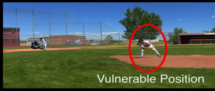
The first alternative cause offered to jurors relates to the injured boy’s pitching form. The defense contention was rather than ending the pitch in a position which allowed him to field the ball, as pitchers are trained to do, the plaintiff in this case ended his pitch in a vulnerable position that increased the risk of injury.
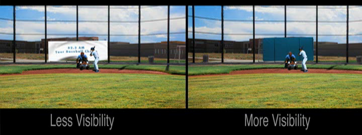
The other alternate cause was uniquely visual: the pitcher’s ability to see the ball. The defense contended a white banner placed behind home plate by a local radio station prevented the ball from standing out clearly and decreased the pitcher’s reaction time after the ball was hit.
In the different versions of the defense presentation, the attorney uses words alone to describe these alternatives, draws them on a flip chart, uses designed images, plays animations, or uses an immersion approach consisting of continuous use of a number of different approaches.
As in the other situations we’ve described, using graphics was significantly better than not using graphics, and using an immersion approach was best of all.
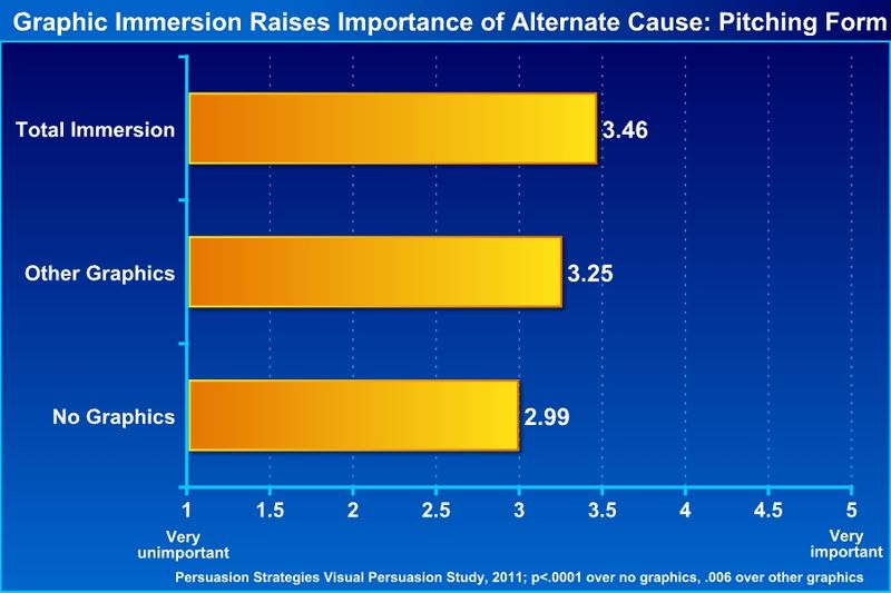
(Please click to see full-sized version)
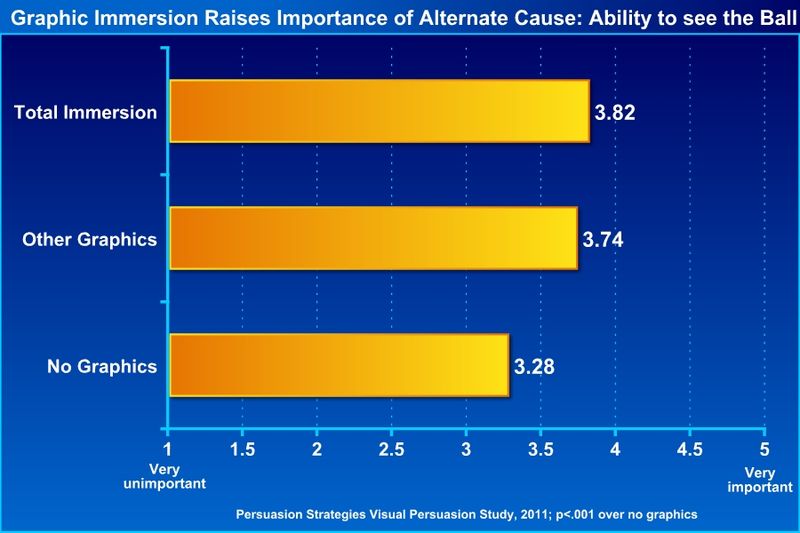
(Please click to see full-sized version)
Recommendations:
1. Decide and focus. Of everything you need to prove (yes, we know, it is all important), decide what is central. Key ways to know: “If they don’t understand this, we lose” or, better yet, “Once they do understand this, they’ll have an easier time understanding everything else.” Once you know that, ask yourself what you are doing, verbally and visually, to make those points stand out. On the two alternate cause arguments mentioned above, for example, the immersion version included animated examples on those points, while nearly all other points were reinforced with static graphics.
2. Test your graphics. Early focus groups and mock trials provide great opportunities to find out what works and what doesn’t work visually. If you ask jurors specifically, “What do you think about this chart?” they are likely to critique the design or execution, in sometimes ideosyncratic ways. Instead ask more generally, “Of everything you heard today, what stands out to you the most?” or even more simply, “Why do you side with party x or y?” Then you follow up with “okay, what else?” a few times, then you are likely to get better information on what is truly important and central to jurors.
3. Don’t just save your graphics for jurors. There is nothing about going to law school, sitting on a bench, or working as a mediator or arbitrator that makes one immune to the benefits of visual persuasion. For example, for a recent contract mediation, we invested substantial time and thought into an interactive timeline. It was pretty slick: Using Flash, it could expand and contract, becoming more or less detailed as the need required, and it included specific documents and testimony could pop out and be highlighted at different points of the story. It turned out the mediator was enamored with the tool and used it to frame his understanding of the story. That is a big advantage any day.
______
Other Posts in This Series:
______
Image Credit: Eyechartmaker.com
