By Dr. Ken Broda Bahm –

As we get to the final post in this series, astute readers will have no doubt noticed one claim that we haven’t made: namely, that graphics will win your case. By themselves, they won’t. That is what we found in our experiment focusing on the reactions of 1,375 mock jurors. When we compared five different approaches to graphics (no graphics, flip charts, static graphics, animations, and continuous graphics use), and compared the reported case leaning, and verdicts on liability and causation, we found no one method presented a statistically significant advantage over the others.
I’ll admit, even for a dispassionate researcher, this was a bit of a dissapointment. As we designed and prepared the study, we had allowed ourselves to dream, “Wouldn’t it be great if, keeping the script constant, we could find the difference between winning and losing in graphics alone?” Alas, not in this case. Perhaps that is a necessary dose of reality. The central caution we leave you with is you won’t win your case because you use graphics. Good visuals do provide a definite edge: they improve comprehension, allow you to compare more favorably to the other side, and help to make the key points more memorable. By themselves, good graphics won’t turn the case in your direction. In this final post, we take a sober look at this final caution and provide some parting advice on focusing your visual persuasion in litigation on what it does best.
The Persuasion Strategies Visual Persuasion Study
Our goal was to see to what extent graphics matters, and what forms of visual persuasion are most effective. To test that, we conducted an experiment based on five separate versions of the same defense presentation, differing only in the style of visuals used, and tested it out against a plaintiff using 1,375 mock jurors. We compared five different approaches to visual persuasion:
1. No graphics
2. Flip chart graphics, created live
3. Static graphics, designed, but not animated
4. Animated graphics
5. Immersion: a mix of static and animated graphics used continuously, so that imagery was shown throughout the presentation
We tested juror perception immediately following the presentations to see how graphics affected a number of outcomes, including leanings and verdict. We’ve reported our findings for the first time in this five-part blog series (See part one for a more complete description of the study).
No Significant Difference on Verdict
In our fictionalized fact pattern, a high school baseball pitcher experienced a brain injury when he was struck by a ball hit from an aluminum alloy bat. The Plaintiff filed a products liability case against the bat manufacturer, arguing that a defective bat design allowed the ball to be hit an an unexpectedly high rate of speed, depriving the pitcher of an opportunity to react in time.
By default, the case leaned in favor of the plaintiff. So what we wanted to test was whether manipulation of graphics use could improve the defense. We did see improved comprehension, better perception of the importance of several central issues, and greater perception of preparedness when the defense supplemented their argument with graphics, particularly when making use of graphics continually rather than occasionally. This did not, however, translate into a reliably higher overall win rate when defense emphasized visual persuasion. While the highest percentage of straight defense verdicts (“no” to both liability and causation) did occur among those mock jurors who had seen the defense version using the “immersion” approach of continuous graphics (followed in order by flip charts, animations, static graphics, and no graphics), the differences were not quite large enough to be statistically significant.
As interesting as it would have been to report a clear significant difference here, it is probably a realistic result we’re reporting. After all, in each of the defense versions we tested, the evidence, the story line, even the specific script did not differ. Where graphic style did make a difference, it was in some pretty key areas: comprehension, perceived importance, and party comparison. The fact this didn’t result in a greater percentage of defense verdicts doesn’t mean anyone would want to sacrifice those advantages.
Recommendations:
Based on the ability to better explain, better show preparedness and effective presentation, and better emphasize what is central to the case, we are confident in the recommendation to use graphics, and to use them continuously rather than just occasionally. Based on the results of this study, an opening statement, closing argument, or expert witness testimony accompanied by a well-designed PowerPoint presentation is more clear and more memorable than one that just uses sporadic graphics, or no graphics at all.
At the same time, it is important to emphasize visual persuasion is not a magic bullet and not all graphics are created equally. The decision of what is best for your case should be based on a thorough analysis of the issues of the case as well as an opportunity to pretest the visuals through mock trial or focus group research. In general, however, there are three golden rules that you can mnemonically remember as “The Three S’s” — Good graphics in litigation should simplify, supplement, and sell.
Simplify
Here is a scenario that has happened thousands of times in the days running up to trial. The team asks for a timeline, then scrutinizes draft copy produced by the graphic designer:
“Wait,” one member chimes in, “the Andersen memo isn’t here…and we need to show where the comment period kicks in…and there was a meeting on the fifth…and we need to show Johnson’s letter was earlier in the day than Elliot’s email…”
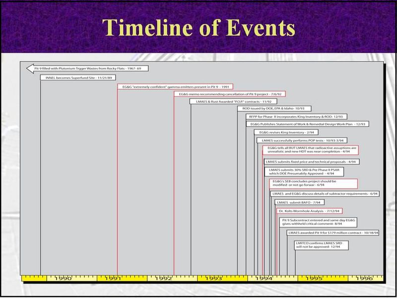
And bit-by-bit, what was a clean timeline of just the critical events becomes a dumping ground for every document and date, important or not. The bottom line is graphics exist to simplify, but far too often the role they serve is to complicate. When the central imperative becomes “include all of the events,” then the resulting graphic is comprehensive at the expense of being clear:

(Click image to see full-sized version)
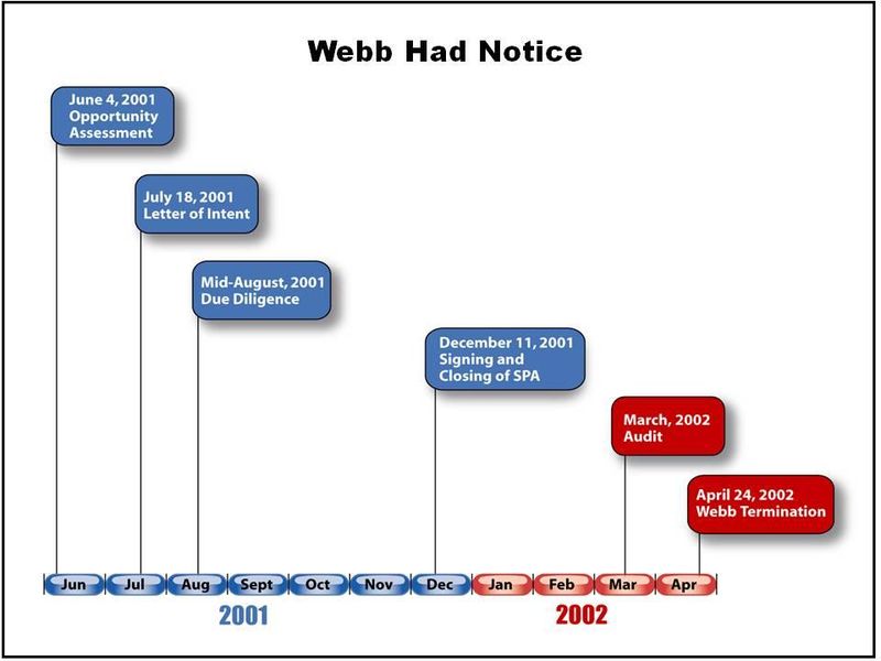
Instead of including everything, the timeline should selectively focus on its own message. By design, it should include only those key events that frame the story as you want the fact-finders to understand it. As you and your witnesses work with the timeline, you will inevitably add more context and details that are not explicit in the demonstrative, but the smaller number of key events will still serve as a reference point for you and jurors. Most importantly, the leaner timeline should convey a clear message. In fact, one test of a good timeline is whether it can be summarized in a short header, like so:

(Click image to see full-sized version)
Supplement
It is important to remember you aren’t simply handing your PowerPoint file to your judge or jury. It isn’t supposed to stand on its own. Instead, visual persuasion works best when it is supplemented by a clear explanation from the attorney or witness.
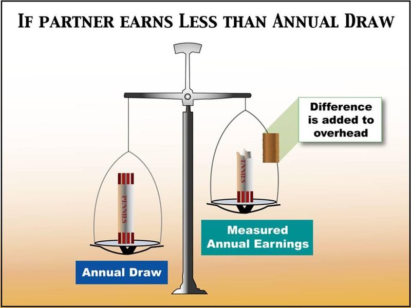
For example, the following graphic does too much, because it tries to include the complete explanation as part of the visual. It invites your jurors to read instead of listen and see.

(Click image to see full-sized version)
Instead, that same explanation is likely to be more clear if it is the verbal accompaniment to a more visual, less text-heavy demonstrative, like so:

(Click image to see full-sized version)
Sell
We want to be on the side of clarity and to feel that a jury with the best understanding of the case is naturally going to side with you. It is nice when that happens, but experienced litigators know juries are usually a little more nuanced than that. There are often points where greater clarity just serves to make some of your adversary’s arguments more clear.
When developing graphics, lawyers, consultants, and graphic designers alike are at risk of falling into the “teacher mode.” That isn’t a bad impulse – after all, jurors are more likely to trust a teacher than an advocate. When you are putting your teacher hat on, it is critical to ask, “Who is most likely to be helped by this better understanding?” Take the following depiction of the process of creating cardboard tubes, for example. By dividing the manufacturing process into simple, numbered, color-coded steps, the graphic makes it simple, clean, and understandable. If that is your goal, then you’ve done a good job. If, on the other hand, this is an intellectual property case in which it is in your interest to make the process seem complex, sophisticated, and “non-obvious,” then your explanatory demonstrative will inadvertantly be selling the other side of the case.

(Click image to see full-sized version)
The demonstrative exhibit should help you explain, but in a way that also subtly helps you to sell your side of the case as well.
These are just a few of the considerations that go into effective demonstrative exhibit design. The best approaches, naturally enough, will be based on a complete analysis of the strengths and weaknesses of your case, and a full understanding of where your greatest needs are to show, as well as tell.
A special thank you to Persuasion Strategies’ graphics team for their work in designing the various graphic versions tested in this study, and in developing the demonstrative exhibit examples (the good ones, not the bad ones) referred to in this series.
______
Other Posts in This Series:
______
Image Credit: Eyechartmaker.com