By Dr. Ken Broda Bahm:

No shortage of discussion lately on gun control, with several states and the federal government considering limits on magazine size, which put a cap on how many bullets can be fired without reloading or changing the clip. But these are actually not the bullets I’m writing about today. Instead, my focus is on something less deadly in the literal sense, but more deadly to chances of good visual communication: bullet points in your PowerPoint presentation. Using bullets can seem like a simple way to walk the audience through your argument, but it isn’t, and the approach actually impedes understanding. We’ve written before (here and here) to join a rising chorus criticizing presenters’ reliance on bullet points. Despite this, walk into most courtrooms, mock trial presentation rooms, or CLEs and you’ll see presenters who keep using bullets like they’ve got an unlimited magazine.
One reason for this might be that the message hasn’t fully gotten out yet. Another reason, though, might be that bullets are simply easy for the speaker (both at the preparation and presentation stages) and the lure of having one’s own speaking notes on the screen can lead presenters to put their own needs ahead of their audience’s. Drawing on a study I’ve only recently discovered (Atherton, 2009), I want to try to put a little more detail behind the the central argument for presenters simply banning the bullet as a visual presentation tool and ceasing a reliance on text as the major part of what is shown on screen.
Cognitive Load and Overload
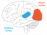
Understanding that many litigators have a longstanding practice of using text-based slides in trial, there are nonetheless good reasons to believe that this is more of a convenience to the speaker than it is an asset to the audience. There is now a sizable and growing body of research focusing on how listeners simultaneously process and understand visual and verbal information, and the research shows that the common practice of presenting slides with multiple bullets of information actually makes it harder for an audience to understand. The reason is that listeners outstrip their own “cognitive load” (the amount of information and thought an individual can process at any given time) when they’re  encouraged to do double-duty using their auditory cortex. Brain research shows that we don’t process written language in the same way that we process a picture using the visual cortex. Instead we essentially ‘talk to ourselves’ as we read and use the auditory cortex – the same region we use when we listen. As a result, the simultaneous presentation of spoken and written speech overtaxes the auditory cortex and outstrips our cognitive load.
More simply, jurors can’t listen and read at the same time, so they choose one or the other, or flip back and forth resulting in lost information. When, on the other hand, the screen is used primarily for visual and not written information, then the listener processes what the attorney is saying with their auditory cortex while processing what is on the screen primarily with their visual cortex.
The Research
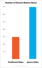
The studies back up the advantages of that approach. For example, Dr. Chris Atherton (2009), a cognitive psychologist, conducted a study in which she compared two randomized groups that were each presented with the same information but displayed in distinct styles. One group received what the researcher called the “Traditional” PowerPoint with heavy text descriptions and bullet lists together with the occasional graphic or chart. The second group received what she called a “Sparse Slide” approach, using the same diagrams or graphics, but with only sparse text. Then Dr. Atherton tested the participants’ learning using short essay questions (a method that doesn’t just measure pure recall but taps into the ability to both recall and use the information in a manner that parallels what jurors need to do in deliberation).  Using independent raters who were blind to whether the participant had seen “Traditional” or “Sparse” slides, Dr. Atherton found that those who saw the sparse slides simply got more. They were able to recall and use more themes from the presentations in the subsequent essay. The differences were both statistically significant and quite substantial, with those in the “Sparse Slide” condition remembering and using more than double the themes. Her own — properly designed — slides for her presentation on this research are available here.
This is just one study in a growing body of cognitive science showing that an audience’s cognitive load is finite and overtaxing it by using text-heavy presentations just leads to lessened comprehension. What this suggests is that if we want jurors to get, to remember, and to use more of what we present to them, then we should adapt an approach that does not overtax their cognitive loads, but instead allows the visual message they’re seeing to complement the auditory message they’re hearing.
The Simple Solution: Don’t Use Bullets
As we’ve noted before, a couple of times, the best visual approach is to pair a single statement with a simple image. So, the most important practical advice in avoiding bullets is just don’t use them. In addition, it is worth remembering that the problem isn’t bullets per se, but the amount of text they encourage. Once you start writing bullets on slides, it’s easy for them to become a magnet for all key ideas. Once that occurs, you’ve got slides filled with words and an audience torn between reading and listening. So here is the rule:
|
Use No bullet points and |
For a look at some simple bulletless slides, you can see our examples here, or some more recent examples at the excellent Visual Sugar blog by Bethany Auck at SlideRabbit.
Best Ways to Avoid Bullets in the First Place
Beyond the simple advice of ‘just don’t do it,’ here are a few best practices for keeping presenters away from that temptation.
1. Start With What You’re Going to Say
Instead of starting out your presentation preparation by opening PowerPoint and starting in on the slides, start instead by creating your outline and main idea content on paper. Instead of facing a deck of slides and thinking, almost as an afterthought, “What am I going to say during each slide?” it is better to start with the verbal component and then ask, “What visuals would best support my content?”
2. Transfer Your Bullets Into Your Notes Field
If you’re editing a slide deck that already includes bullets, or if it simply helps you to think of your content in bullet points, then the best solution is to move those bullets off the screen and into the “notes” field PowerPoint or Keynote makes available just below the slide in the editing view. If you want to view your notes during the presentation, you can use the “Presenter’s View” so your monitor is showing your notes along with the current and next slide, while the projector is showing only the current slide. This is easy to do using a Mac, and is also possible, with some perseverance, using a PC.
3. Be Creative, and Not Stock, in Your Graphics Selections
Of course the simplest way to create slide without bullets is to pair a bunch of titles with a piece of clip art or a stock photo. In all, that is probably still more effective than using bulleted slides, but it doesn’t take full advantage of your options. The occasional use of a stock image is fine, but repeated use can wear thin, as this story of a recent prosecution points out. Ultimately, nothing is better than original graphics designed for your specific purpose. But even in the absence of that kind of budget, presenters should stretch themselves: Use a graph instead of numbers, show percentages as pie charts, use figures and case-related photos as much as possible. The closer you are to that, and the further you are from cute clip art and those little ink blot people, the better off you’ll be.
It is understandable that litigators, especially those who have relied on text-based slides for a long time, will feel a bit vulnerable without the security of their bullets. But its important to remember, your ammunition is your arguments, your evidence, and your ability to engage your fact finders visually and persuasively. Your ammunition is not your bullets.
______
Other Posts on Visual Persuasion
- Follow the Ten Commandments of Graphics Use in Trial
- Careful, Your Animation May Be Promoting Hindsight
- Keep an Eye on Your “Truthiness”
______
Atherton, C. (2009). “The Effects of Visual and Auditory Presentation on Cognitive Load.” Presentation to the Technical Communication UK Conference. Slides from presentation available at: http://www.slideshare.net/CJAtherton/chris-atherton-at-tcuk09
Image Credits.: ThreeIfByBike, Flickr Creative Commons