By Dr. Ken Broda Bahm:
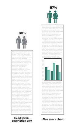
Lawyers like to be efficient in communication, particularly in the setting of litigation, bound as it is by time and relevance. Perspicuity when persuading is considered a virtue in that setting and “Don’t do what isn’t necessary” is generally a good rule to follow. But on the subject of graphics, don’t carry that rule too far. Take, for example, the idea of using a chart or a graph in order to illustrate some kind of numerical relationship. If the question is, “Do I really need this?” the answer could be, “No – these jurors are literate and can understand the idea of a ’15 percent increase’ without me showing it to them.” But don’t forsake the graphics too quickly. A recent study confirms the intuition that “seeing is believing,” even where what is seen carries only a trivial difference from what is described. Just using a chart substantially increases persuasive effect, according to a recent study by two Cornell researchers, (Wansink & Tal, 2014). Comparing the effectiveness of a simple text to the effectiveness of that same text with a basic chart, the study found that adding the simple graph increased beliefs about a medicine’s effectiveness from 68 percent to 97 percent. “But here’s the kicker,” the New York Times reported, “That chart contained no new information; it simply repeated the information in the orginal vignette.”
According to the study, the improved persuasiveness came not from additional data or reasons, or from improved compehension, but instead simply came from a positive association with science. “Even trivial elements can increase public persuasion despite their not truly indicating scientific expertise or objective support,” the study authors concluded. Adding a chart doesn’t make the claim any more scientific, but the visual data primes the audience toward that mode of thinking. As a result, they’re more persuaded by the data. The implication of this for courtroom persuasion is clear: Litigators should always lean toward visualizing any data that they talk about – not just the complex data, but all data. The question should never be, “Can they understand the point without the graphics?” but should instead be, “Can we simply show it as well as tell it?” This post takes a look at the research, and suggests a few less common ways that graphics can be used to consistently illustrate arguments in court.
The Research: Seeing the Data Means Believing the Point
Researchers Aner Tal and Brian Wansink of Cornell University’s School of Applied Economics and Management examined the hypothesis that “The appearance of being scientific can increase persuasiveness.” Using a very simple study design, they compared the effectiveness of two versions of a short research article on a medication’s effectiveness. Both articles contained the same data: 47  percent of those taking the medicine suffered from the illness, compared to 87 percent of the control group. Pretty easy to understand, right? That information led to 68 percent of the experimental participants believing that the drug was effective. Adding a simple bar chart showing that same 47 versus 87 percent relationship, however, brought the effectiveness up to a convincing 97 percent.
Why does that work? It isn’t just comprehension, since anyone with the most basic numeric literacy can understand the relationship between 47 and 87 percent without needing to see it. Instead, the graph’s effectiveness appears to stem from a halo of legitimacy surrounding the impression of science. In a subsequent study, the team also showed that a similar advantage resulted from the use of an incomprehensible chemical formula within the text. The additional information increases the degree of attention given to the data and places it within a credible frame. Providing further support for this conclusion, the research found that the effect was more pronounced among those who believed strongly in science.
Of course, the version with the bar chart is also more immediately understandable and more saliant to the viewer. That increases the chances that the data will be noticed, remembered, and used in forming an opinion. Admit it: You looked at the chart before you read the previous two paragraphs.
The Implication: Visualize Even the Simple Stuff
The finding that even simple graphs dramatically increase persuasiveness is good news, because simple graphs don’t take much time to create or explain. Due to their immediacy in being understood, simple charts can actually save you time during opening, testimony, or closing. Unless you’re forced to put something on the record that you really don’t want jurors to remember or use (and that seems pretty rare, but not impossible), then you are better off showing that data in a chart.
When it is a straight-up case of needing to show the results of research, attorneys generally understand the advantages in displaying the data in graphic form. But here are a few uses of charts that are less common, but still a good idea:
Use Charts to Show Proportion: In one case, we needed to convey to the jury the power of a particular chemical. To show a concentration of just one molecule in a thousand was enough to cause harms, we showed a demonstrative with just one tiny red dot among a field of 999 blue dots.
Use Charts to Distribute Responsibility: If your verdict form includes an apportionment of responsibility and you want to propose a starting point for jurors in deliberation, using a pie chart will help jurors to remember and anchor upon a particular distribution.
Use Charts to Argue Damages: Damage numbers are most often presented in a table, but using a chart, you can make different points with the numbers. For example, a bar chart might convey that the difference between defense and plaintiff numbers isn’t all that great, and subtly suggest a mid-point. Using a pie chart might show that most of what the plaintiff is asking for is in the noneconomic category.
The point in using charts wherever possible is one part of an “immersion” strategy in aiming for the verbal persuasion to be more or less continuously accompanied by visual persuasion. As often as you ask, “What should I say?” you should be asking, “What can I show?”
______
Other Posts on Visual Persuasion:
- Make Colors Meaningful
- Animate: Give Your Jurors Three Dimensions, or More
- Don’t Whine About ‘Argumentative’ Demonstratives (and Argue Back Against Whiners)
______
Tal, A., & Wansink, B. (2014). Blinded with science: Trivial graphs and formulas increase ad persuasiveness and belief in product efficacy. Public Understanding of Science, 0963662514549688.
Image Credits: Lead image from GrapeCity, Inc., Flickr Creative Commons.
